
How to Build Mobile-Friendly Healthcare Sites in 2026
Learn how to build mobile-friendly healthcare sites in 2026. Enhance patient experience with fast loading, easy navigation, and secure booking.

How to Build Mobile-Friendly Healthcare Sites in 2026

Your patients are already on their phones. They’re searching for your clinic, checking your hours, and deciding whether to book an appointment, all before they ever walk through your door. If your site isn’t built for mobile, you’re losing them before the conversation even starts. Knowing how to build mobile-friendly healthcare sites means more than making things look good on a small screen. It means designing for how patients actually behave: quickly, on the go, and with zero patience for a slow or confusing experience.
The sites that win patient trust share a few core traits:
- Fast load times (quick loading on mobile)
- Simple, thumb-friendly navigation with clear menus and visible call-to-action buttons
- Easy appointment booking with minimal steps
- Accessibility compliance under WCAG and ADA standards
- HIPAA-compliant forms and data handling throughout
Get these right, and your site becomes a patient acquisition tool, not just a digital brochure.
Why the mobile healthcare traffic numbers should wake you up
The shift is already complete. Over 60% of healthcare-related internet traffic is now mobile, and 72% of patients search for appointments online using their smartphones. That’s not a trend to prepare for. It’s the reality your site is operating in right now.
Stat worth knowing: A significant portion of visitors abandon a website if it takes more than a few seconds to load. For a healthcare practice, every one of those exits is a patient who didn’t book.
Google’s mobile-first indexing makes this even more urgent. Google crawls and ranks the mobile version of your site first, so a desktop-only design doesn’t just frustrate patients. It actively tanks your search visibility. A few other realities shaping 2026:
- Patients searching “urgent care near me” or “clinic open now” are almost always on a phone
- Slow or broken mobile experiences push patients directly to a competitor’s site
- Local search results heavily favor sites with strong mobile performance and consistent NAP (name, address, phone) data
If your practice’s mobile site is an afterthought, your Google rankings reflect that.
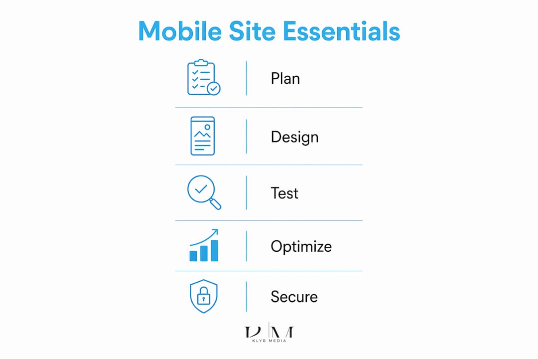
What mobile-friendly design actually does for your practice
The business case for responsive healthcare websites is direct. Patients who can find what they need quickly are far more likely to book, return, and refer others. Here’s where the gains show up most:
- Appointment volume: Optimized mobile booking forms can increase appointments by up to 30%, according to mobile optimization research.
- Patient retention: A site that loads fast and navigates cleanly signals professionalism. Patients associate a good digital experience with good care.
- SEO and local visibility: Responsive design eliminates the need for a separate mobile site, consolidating your SEO authority into one URL and improving local search rankings.
- Legal compliance: Touch-friendly, accessible design helps meet ADA requirements, reducing liability exposure for your practice.
- Reduced bounce rates: Faster pages keep patients on your site long enough to act, whether that’s calling your office or completing a booking form.
The practices that treat mobile design as a core operational priority, not a cosmetic upgrade, see the clearest results.

Mobile-first and responsive design: what they mean in practice
Mobile-first design means you start with the smallest screen and work up, not the other way around. That’s a real mindset shift. Instead of shrinking a desktop layout, you’re asking: what does a patient on a phone absolutely need to see and do? Everything else gets cut or moved.
Responsive design is the technical layer that makes this work across devices. A responsive layout uses flexible grids and CSS breakpoints so your site adapts gracefully whether someone’s on a 375px phone screen or a 1440px desktop monitor.
Practically, this means:
- Design for small screen widths first. If it works on smallest screens, it scales up cleanly.
- Touch targets need to be at least 44x44 pixels. Buttons and links that are too small cause tap errors and frustration.
- Navigation must be thumb-accessible. Hamburger menus, sticky headers, and bottom navigation bars all reduce friction for mobile patients.
- WCAG 2.1 AA compliance covers color contrast, keyboard navigation, and screen reader compatibility. For healthcare sites serving patients with disabilities, this isn’t optional.
One common mistake: treating responsive design as a checkbox rather than a foundation. A site can technically be “responsive” and still be nearly unusable on mobile if the content hierarchy, font sizes, and interaction patterns weren’t designed with a phone in mind from the start.
Pro Tip: Test your site on real devices, not just browser emulators. Emulators miss touch behavior, font rendering differences, and real-world load times on cellular networks.
Design and content choices that make or break the mobile experience
The visual and content decisions you make have a direct impact on whether patients stay or leave. A few principles that consistently separate good mobile healthcare sites from frustrating ones:
- White space is your friend. Cramped layouts overwhelm patients on small screens. Generous spacing between elements makes content scannable and reduces cognitive load.
- Font size matters more than you think. Body text should be at least 16px. Anything smaller forces patients to pinch and zoom, and most won’t bother.
- High contrast is non-negotiable for readability. WCAG AA requires a 4.5:1 contrast ratio for normal text. This also helps older patients, a core demographic for most practices.
- CTAs need to be visible without scrolling. “Book an Appointment” and “Call Us” buttons should appear above the fold on mobile, styled in a color that stands out from the background.
- Forms should ask for as little as possible. Every extra field is a reason to abandon. For mobile appointment booking, capture the minimum: name, contact, preferred time, and reason for visit.
Content hierarchy matters too. Patients on phones are scanning, not reading. Lead with the most critical information: your specialty, location, hours, and how to book. Push detailed content like staff bios and blog posts further down the page or into secondary navigation.

How to get your mobile healthcare site loading fast and ranking well
Page speed is critical for healthcare sites. Google expects mobile pages to load quickly to meet user satisfaction, with abandonment increasing notably after a few seconds. Getting there requires deliberate technical work:
Speed benchmark: Aim for a Google PageSpeed Insights score above 90 on mobile. Most healthcare sites score far lower than that without active optimization.
- Compress every image. Use WebP format and lazy loading so images below the fold don’t slow the initial render.
- Minimize JavaScript and CSS. Unused scripts are one of the most common causes of slow mobile load times. Audit and remove what you don’t need.
- Enable browser caching and use a CDN. A content delivery network serves your site from servers closer to the patient’s location, cutting latency significantly.
- Use mobile-optimized metadata. Title tags and meta descriptions should include local keywords like your city, specialty, and service type to capture “near me” searches.
- Add structured data markup. Schema for medical organizations, clinic hours, and telehealth services helps Google display rich results, which improves click-through rates from local searches.
Local SEO for healthcare also means keeping your Google Business Profile updated and ensuring your NAP data matches exactly across your website, directories, and social profiles. Inconsistencies confuse search engines and cost you local ranking positions. For a deeper look at website optimization for healthcare, the technical and SEO layers work together, not in isolation.
Expert guidance on HIPAA compliance and mobile security
A mobile healthcare site that collects patient data, and virtually all of them do, carries legal obligations that go beyond good design. HIPAA compliance on mobile requires specific technical safeguards, not just a privacy policy page.
HIPAA-compliant mobile sites require:
- Encrypted data transmission (TLS/SSL) on every page, not just checkout or login screens
- Secure hosting with business associate agreements (BAAs) in place with your hosting provider
- Biometric authentication options for patient portal access, reducing reliance on weak passwords
- Session timeout controls that automatically log patients out after a period of inactivity
- Encrypted contact and appointment forms so patient-submitted information is protected in transit and at rest
Accessibility and compliance overlap more than most practices realize. WCAG and ADA standards for patients with disabilities are legally required in many healthcare settings, and failing them creates both usability problems and legal exposure. Screen reader compatibility, captioned video content, and keyboard-navigable forms aren’t extras. They’re baseline requirements for a site serving a diverse patient population.
Simplifying workflows also reduces security risk. Fewer form fields mean less sensitive data collected. Fewer steps to book an appointment mean patients complete the process rather than abandoning it midway and calling your front desk instead. That’s a win for HIPAA-compliant web design and for patient experience at the same time.
Pro Tip: Run a HIPAA compliance audit on your mobile site at least once a year. Regulations update, your site changes, and gaps appear. Catching them early is far cheaper than a breach.
Key Takeaways
A mobile-first approach, built on speed, accessibility, and HIPAA compliance, is the most direct path to a healthcare site that converts patients and holds up under scrutiny.
| Point | Details |
|---|---|
| Mobile traffic dominates | A majority of healthcare site traffic is mobile; design for that reality first. |
| Speed drives bookings | Pages loading over 3 seconds lose 53% of visitors; Google recommends targeting under 2 seconds for high user satisfaction. |
| Mobile-first means starting small | Design for the smallest screen first, then scale up, not the reverse. |
| HIPAA compliance is technical | Encrypted forms, secure hosting, and session timeouts are required, not optional. |
| Local SEO depends on mobile | Consistent NAP data and structured markup determine your visibility in local searches. |

